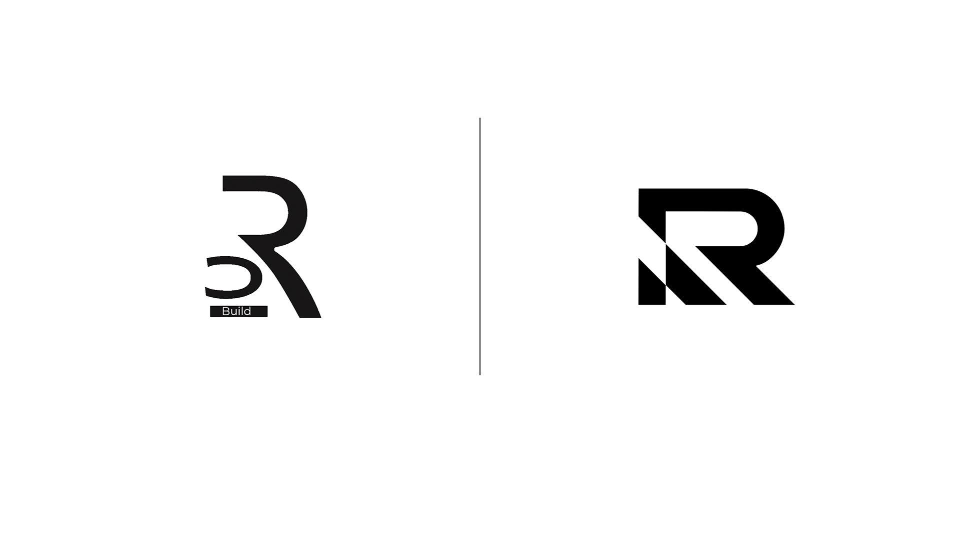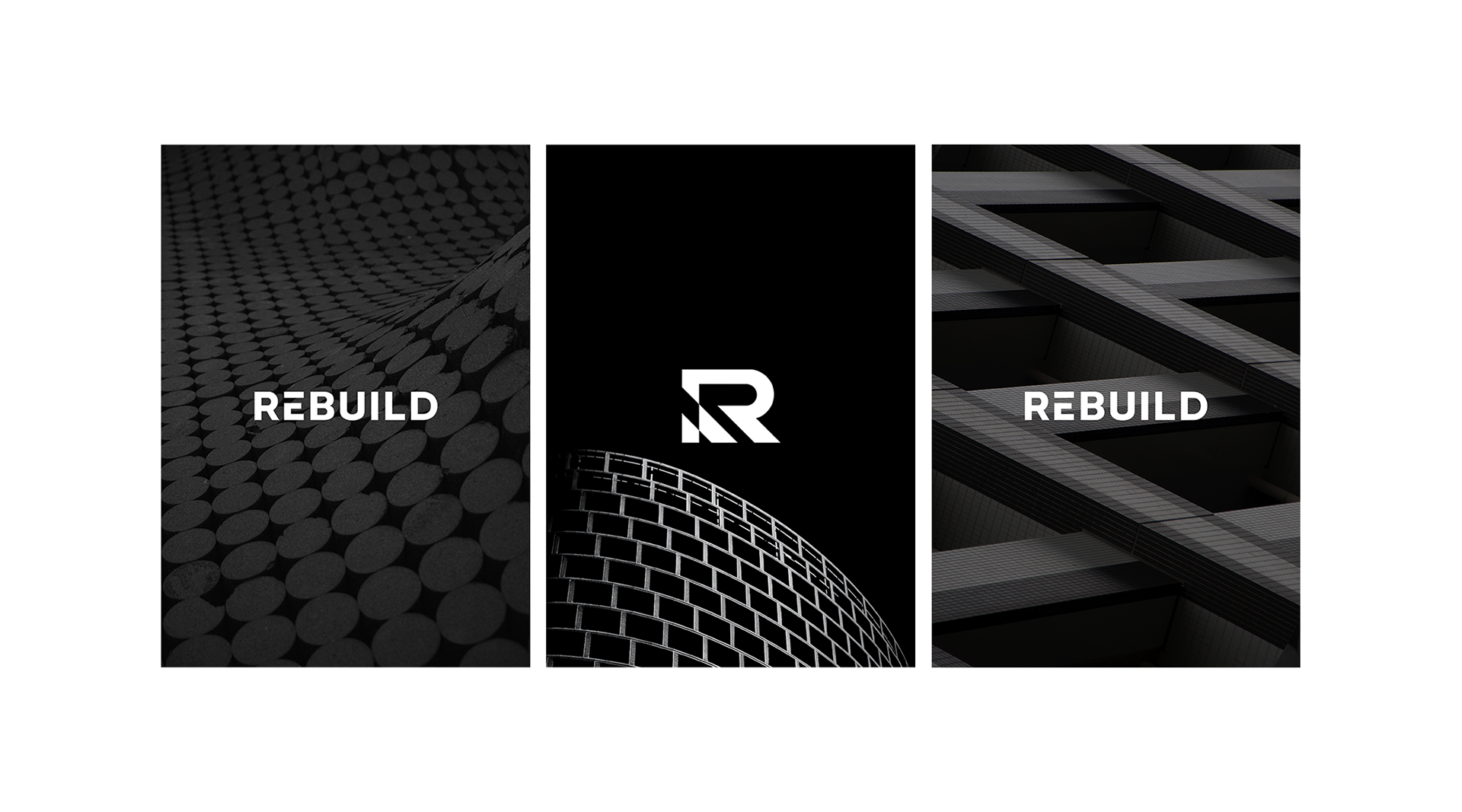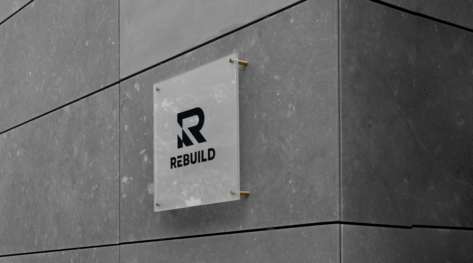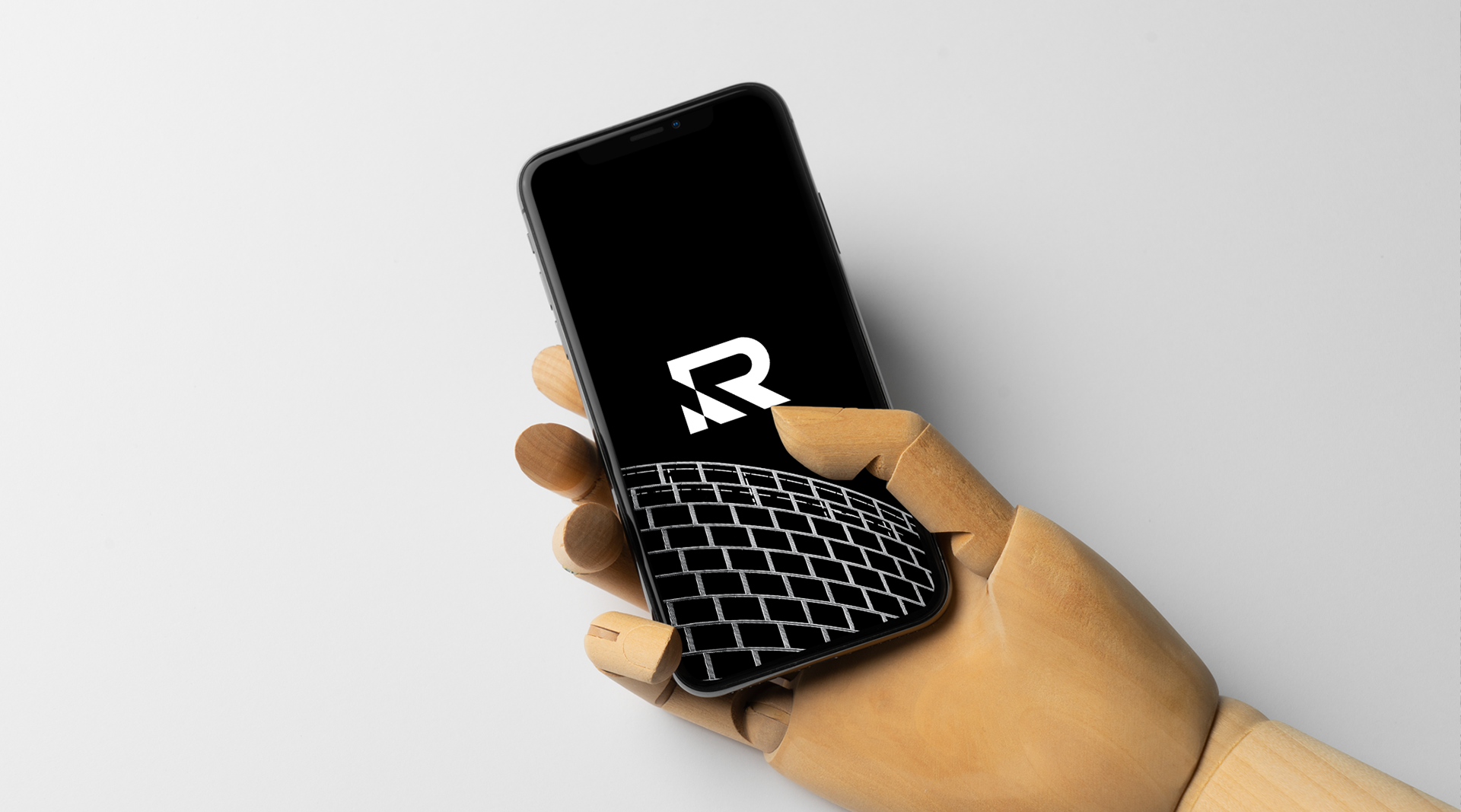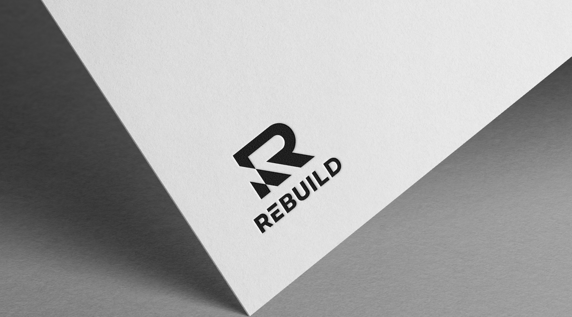
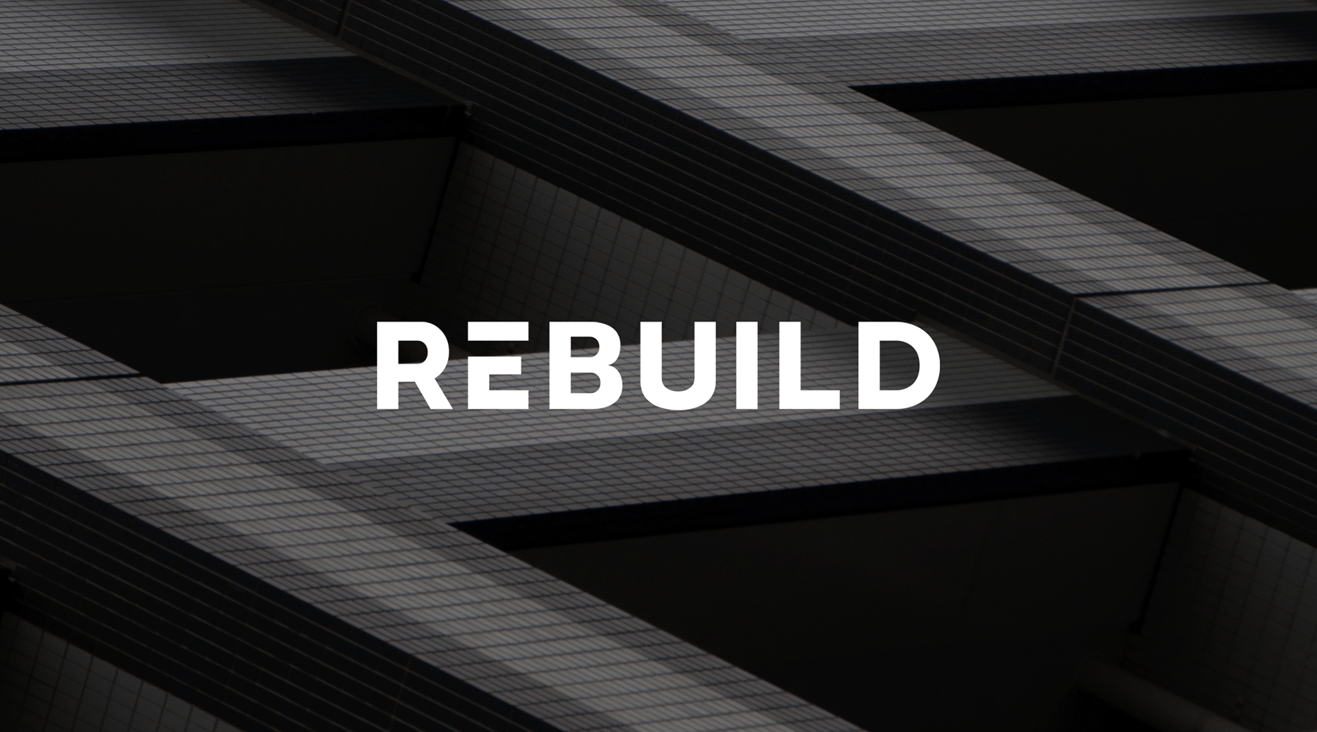
Rebuild
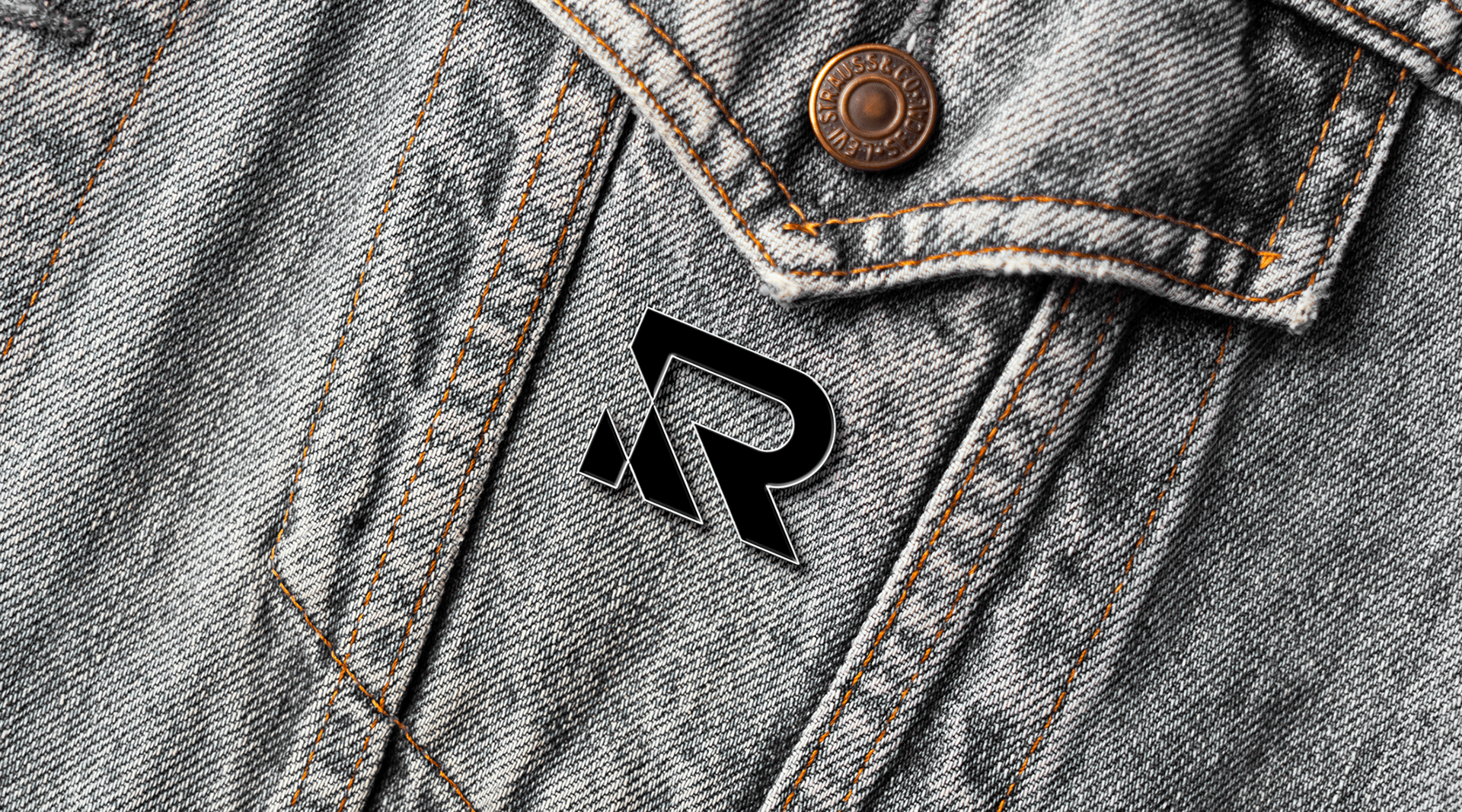
A marca foi criada com linhas fortes e robustas com o objectivo de passar toda a segurança e
profissionalismo que a empresa oferece.
O ícone principal tem uma forte presença na identidade da marca,
representando a Reconstrução da letra "R".
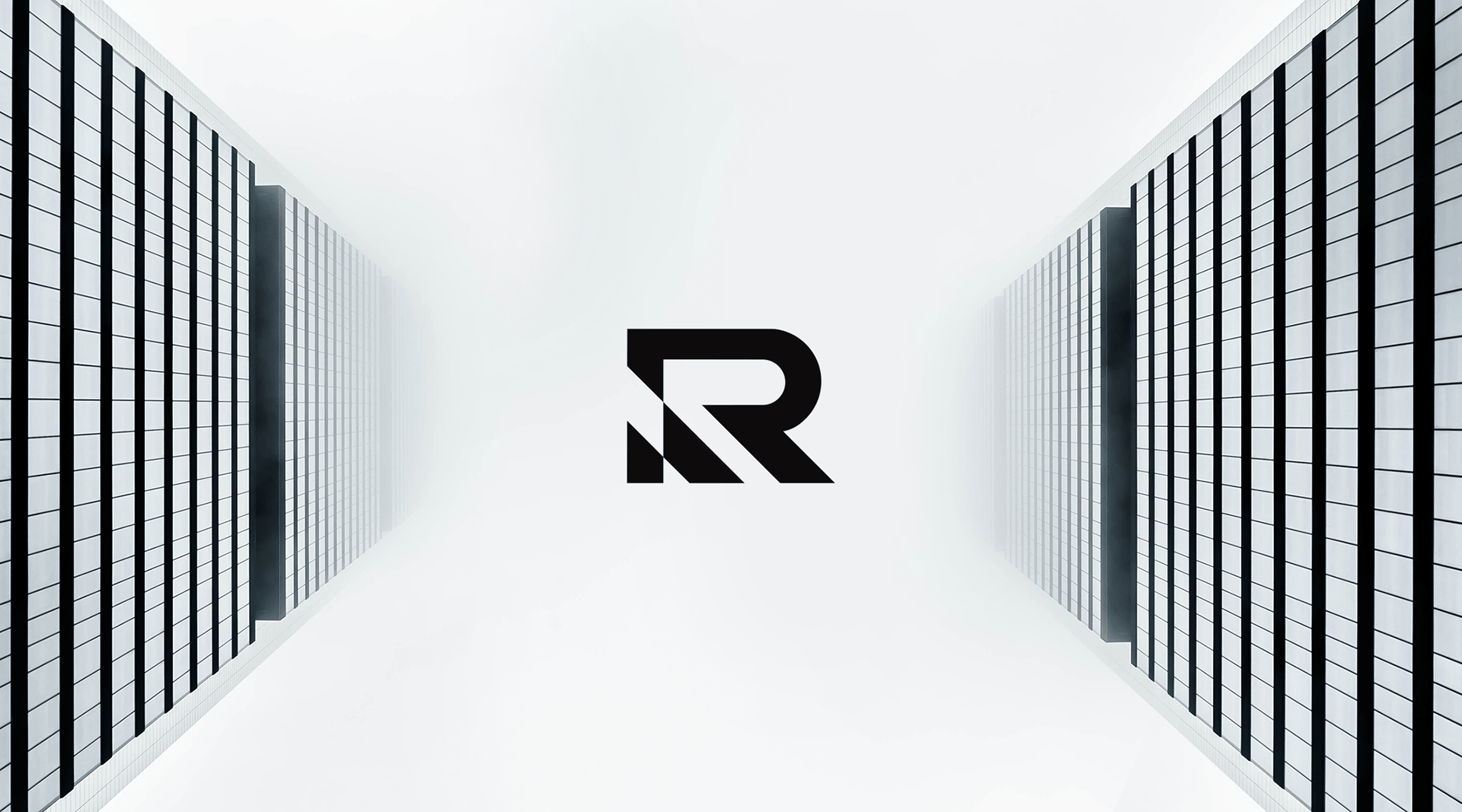
A marca foi criada com linhas fortes e robustas com o objectivo de passar toda a segurança e
profissionalismo que a empresa oferece.
O ícone principal tem uma forte presença na identidade da marca,
representando a Reconstrução da letra "R".